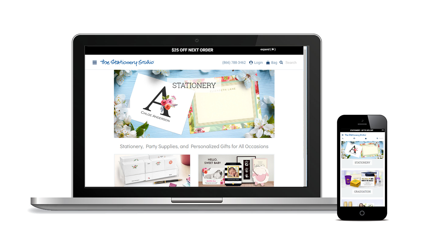
This website was redesigned to fit into the Bootstrap framework for a mobile ready experience. Being an Ecommerce website, Featured on shows like the TODAY show and CBS, This website specialized in custom stationery and gifts for special events and occasions.
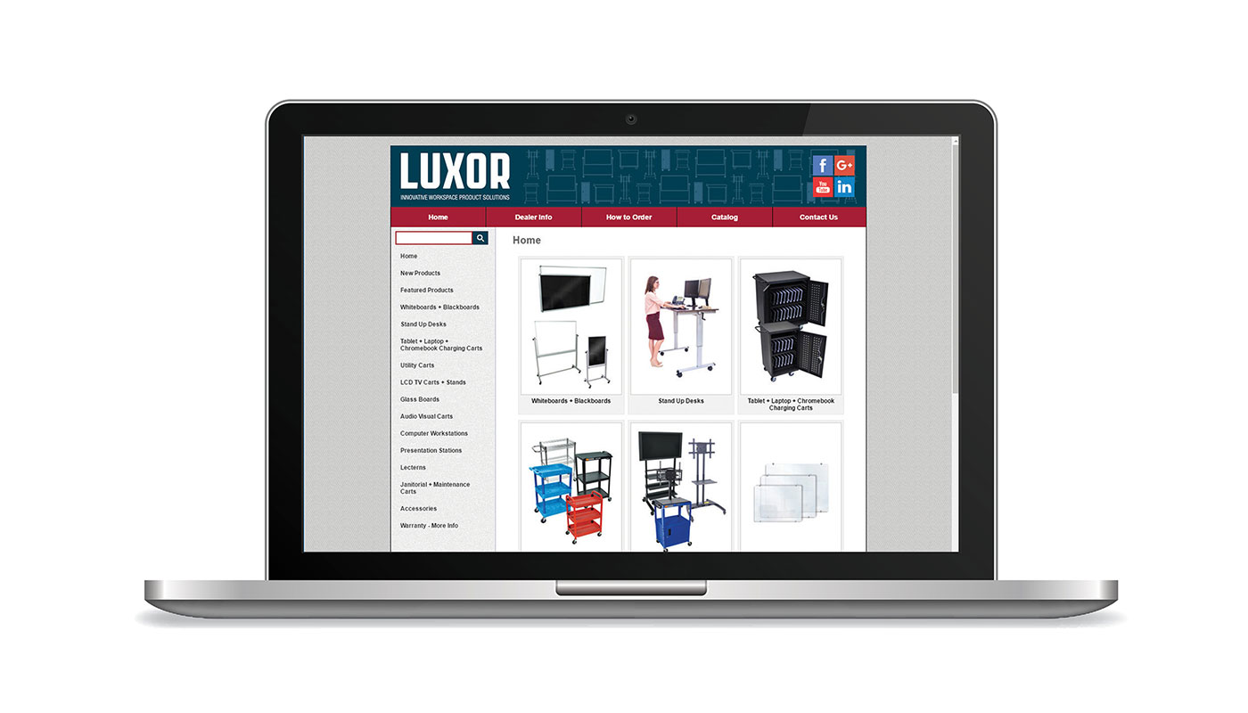
This site was built from the ground up using standard HTML and CSS practices, PHP was used for things like includes and quality of life aspects and the entire site runs off a SQL Database. The product pages feature image galleries that run off Javascript and custom videos embedded from YouTube and a custom search through Google.
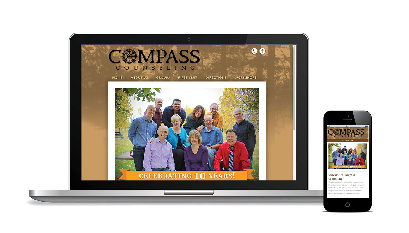
This website was designed for a local counseling practice and has word press for a content management system, this made it easy for the client to make additional website changes on their own. It also features responsive design for mobile.
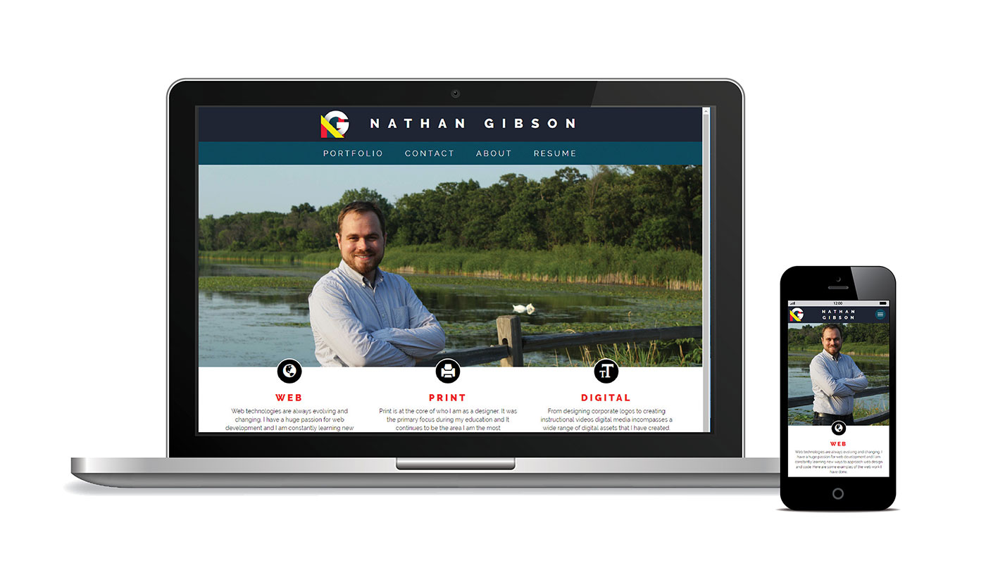
This is my own personal portfolio website, much of this website runs using Bootstrap as a framework and is completely responsive and mobile friendly.
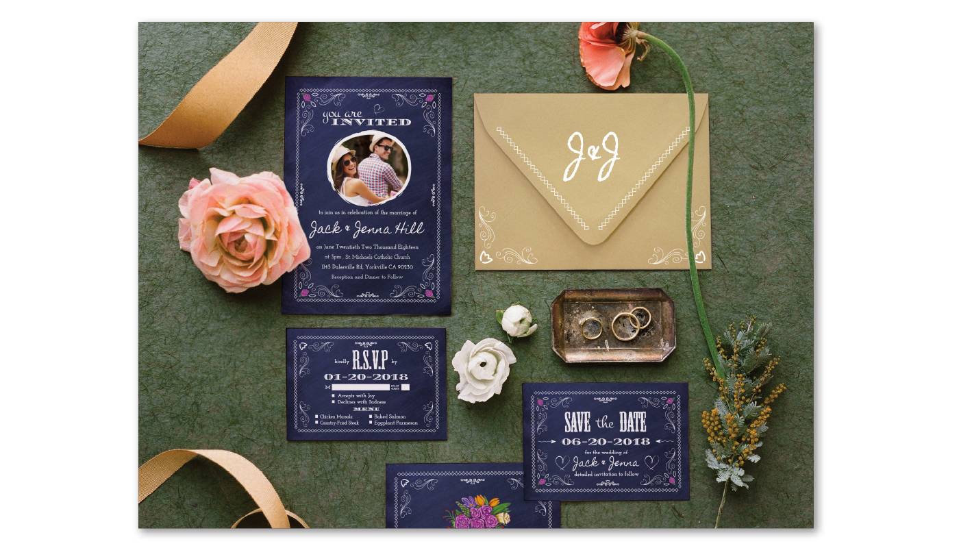
This is a concept project for Cards designed for a wedding. The style is elegant and sleek with a unifying Typography choice present throughout out the designs.
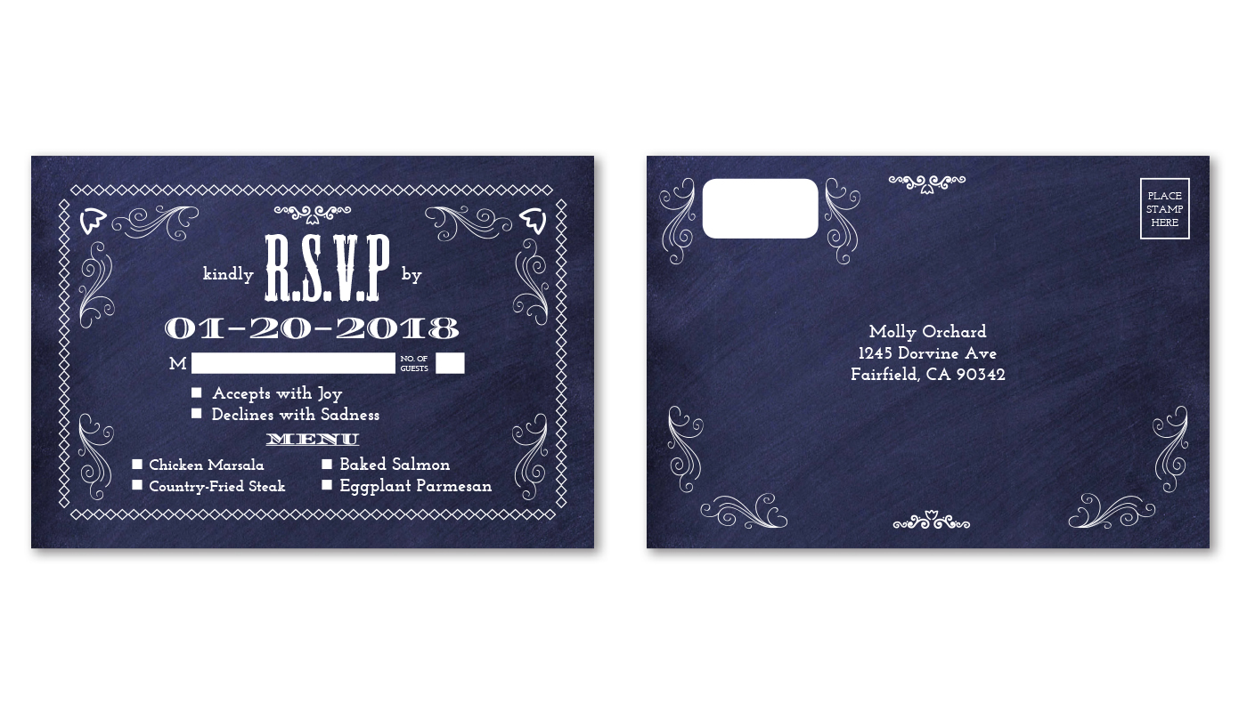
Similar to the save the date the R.S.V.P is also a notice first and foremost with the most important point of the text becoming the center of attention followed by some text and checkboxes.
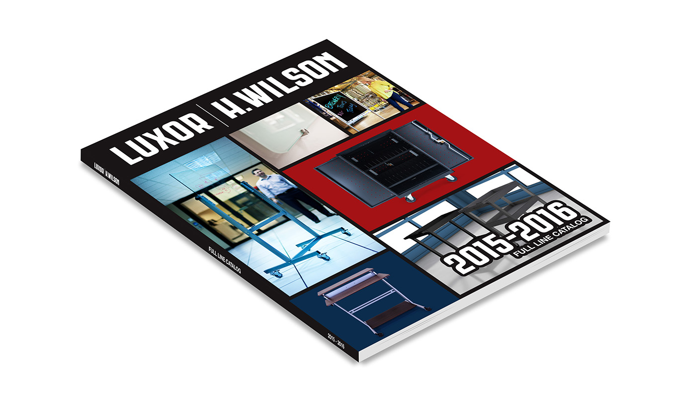
This catalog helped give Luxor a new sense of brand identity. It contained hundreds of products thoughtfully and carefully laid out to create the most attractive sales pitch for prospecting customers.
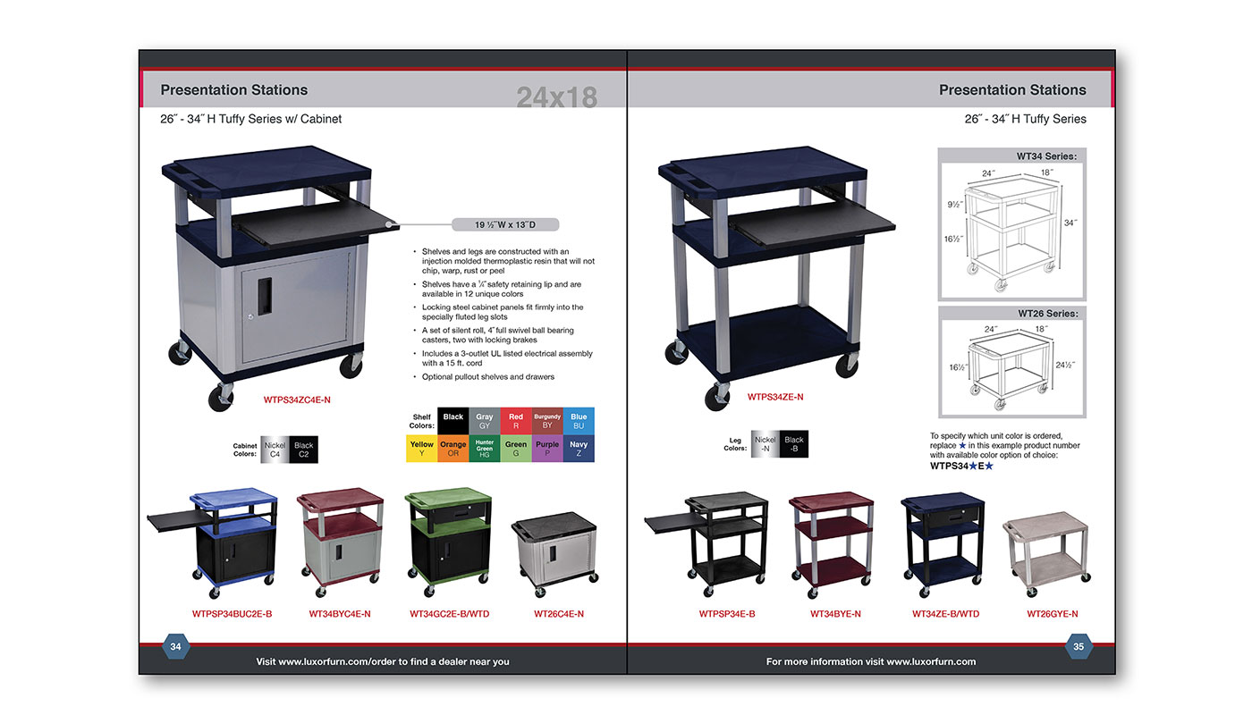
Often there were many different color options to choose from, it was carefully considered which color options worked best with each other so only the best color options were featured as a sales pitch.
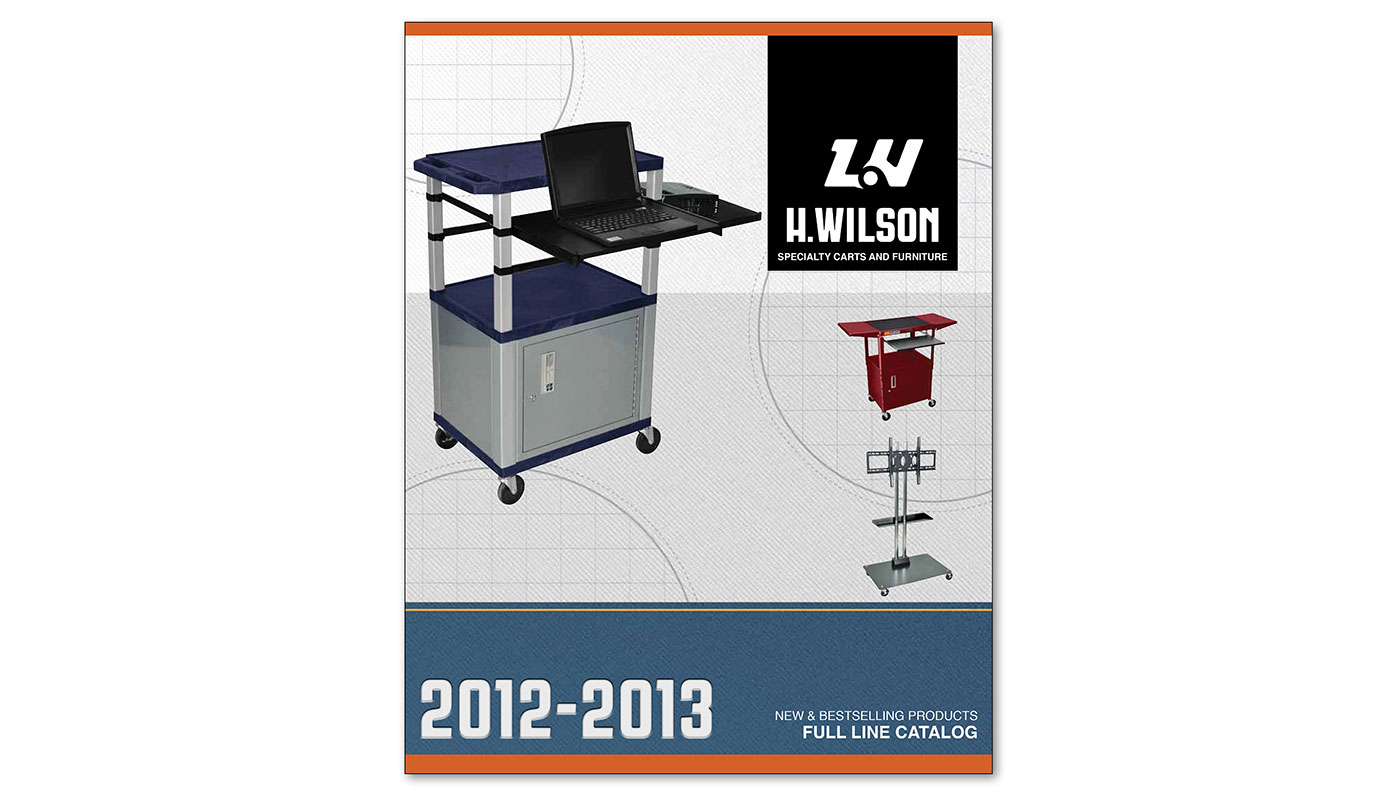
An annual catalog for H. Wilson. This catalog incorporated a wide variety of advanced adobe Illustrator and InDesign styling and patterns.
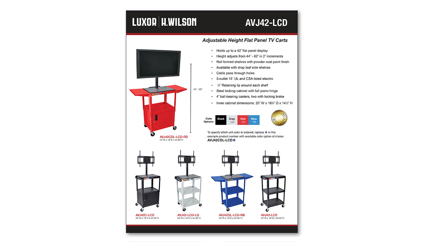
These sheets were the primary means for the sales team to create quick personal pitches to prospecting buyers. The layout is simple and clean to let the product speak for itself.
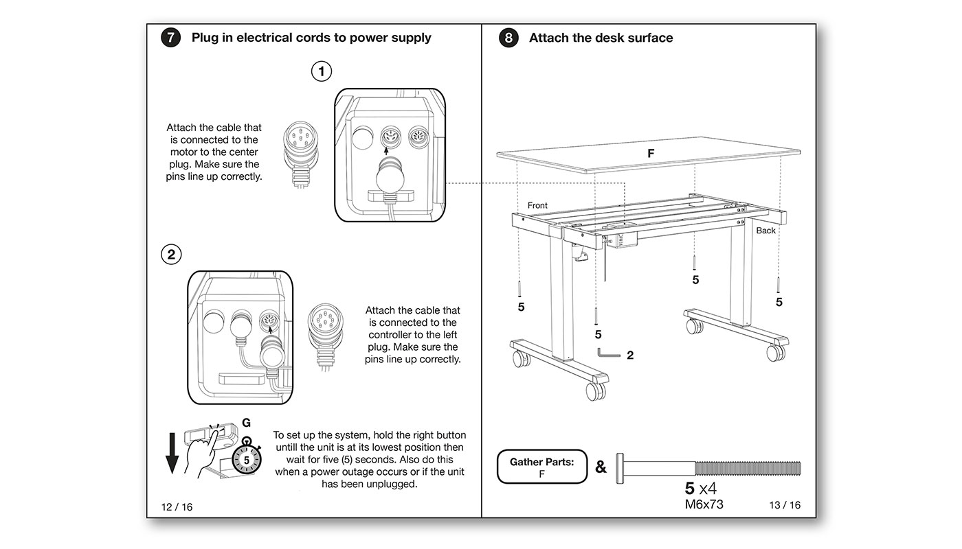
Many are designed as simple one page sheets and many are detailed step by step booklets.
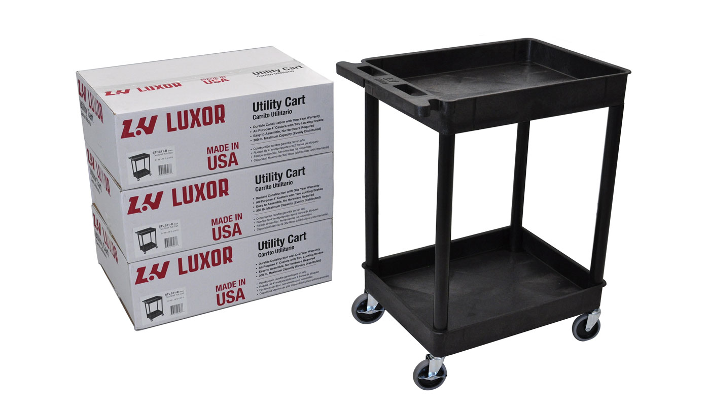
Printing on the package helped give the company a strong brand identity in established retail locations.
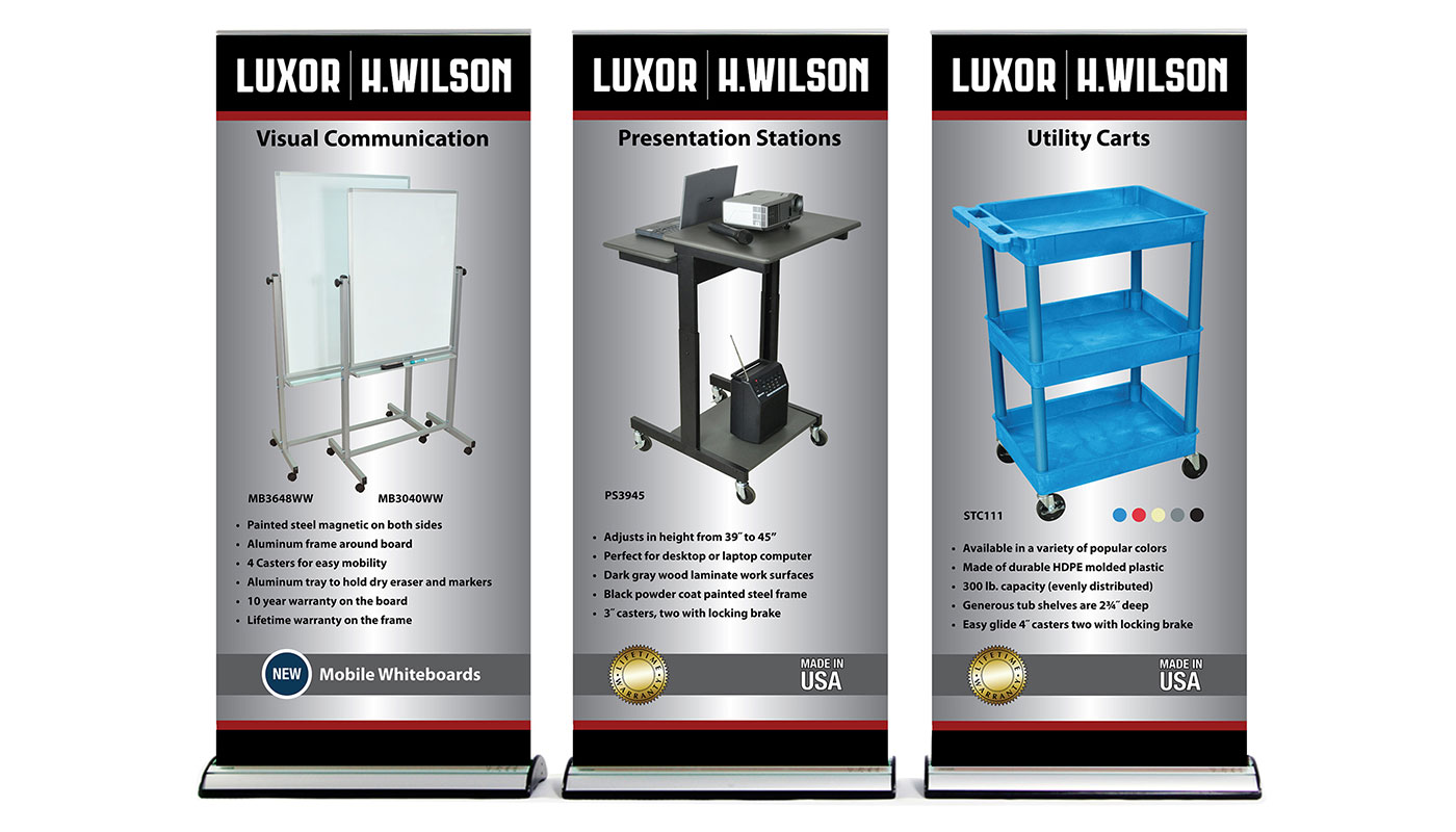
Dozens of tradeshow materials were also required. Product banners were created to give the Luxor booth a strong presentation on the show floor.
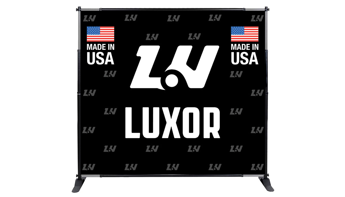
A backdrop was also created to give a strong brand identity and help the Luxor booth pop at trade shows.
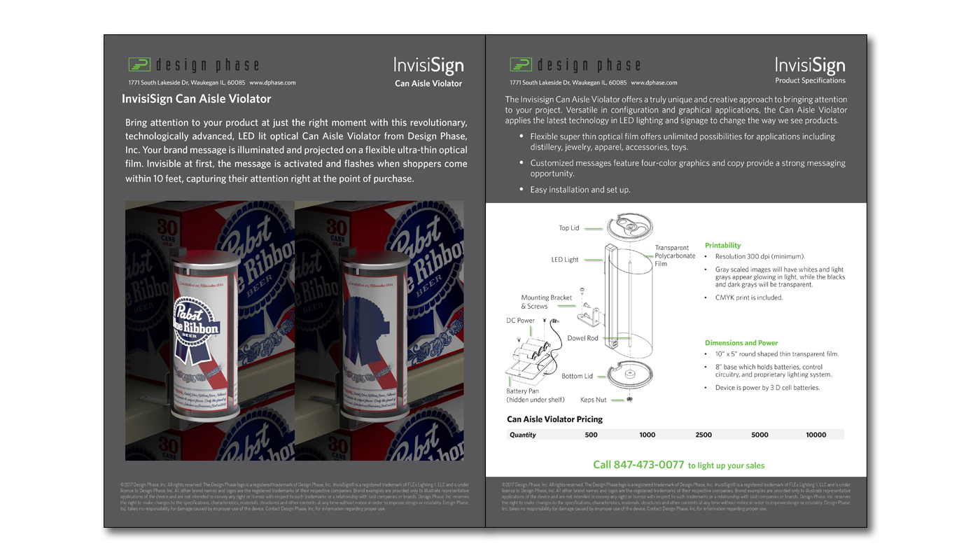
This pricing sheet was created for a new sign tech that uses motion activated LED lights an emulates the look of a can.
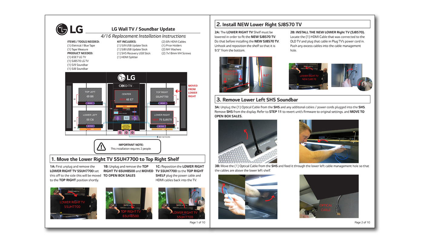
This instruction sheet was for LG's high profile TV Wall in stores like best buy and this sheet covered how to update several of the TVs and Sound bars on that wall.
Created for a local counseling practice, the logo embodies a very natural rustic feel with the intricate compass design drawing your eye in.
This logo was for an annual men's counseling retreat and incorporates a variety of fonts and images approved by the client.
The logo for my portfolio site is meant to represent the spirit and drive of my character, made with bright and rich colors the N intersects with the G and creates a visual effect of coming out of an envelope.
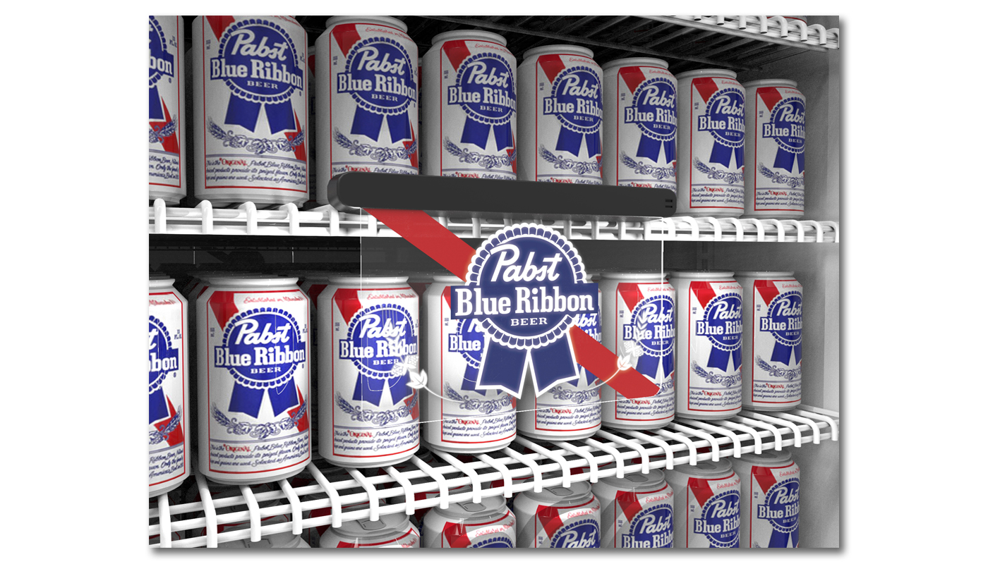
Created as a prototype this project utilized Maya and Keyshot to create a 3D environmental shot to present to prospective clients.